|
YOUR Full
Name
(Mandatory): |
Please
enter YOUR full name in this box |
Subject Surname (Optional):
(The person who has written the handwriting) |
Please
enter the last name of the person who has written the handwriting. |
Subject First
Name
(Optional):
(The person who has written the handwriting) |
Please
enter the first name of the person who has written the handwriting |
|
Subject Gender? (Mandatory): |
Male
Female |
|
Subject Title? (Optional): |
Mr.
Mrs.
Ms.
Miss. |
|
Please
answer ALL remaining questions |
Age Category?
Please
indicate the approximate age of the subject (person who has produced
the handwriting sample). |
Under 16
16 - 20
21 - 40
41 - 60
over 60 |
Sample Size?
Please
indicate the approximate size of the handwriting sample. |
Very small sample
(5 words or less)
Moderately small
sample (1 - 5 lines)
Average sized
sample (6 - 15 lines)
Moderately large
sample (15 - 20 lines)
Very large sample
(21 lines +) |
Ink Colour
Please
indicate the ink colour used for the handwriting sample. |
Blue
Green
Red
Black
Other |
|
Is this ink colour chosen freely by the user and is it used habitually? |
No
Yes
Don't Know |
Writing Implement
Used?
Please
indicate the type of writing implement used to produce the handwriting
sample. |
Fountain Pen
Biro (Ballpoint)
Fibre-tip
Pencil
Crayon/Other |
Paper Plain
or Lined?
Please
indicate if the paper was plain (blank) or lined for the handwriting
sample. |
Plain (Not lined)
Lined |
HANDWRITING FLOW
All
handwriting tends to have a certain type of flow. There are two
main categories (restrained and released), but a lot of handwriting
falls between these extremes. |
|
RESTRAINED
handwriting is rigid and taut. The letters are like guardsmen
on parade. The forward movement of the pen looks as though it
has been carefully restrained. The writing does not flow, and
there is no sloppiness or freedom of movement in the writing. |


|
|
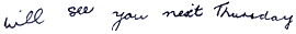
RELEASED
handwriting is the opposite. The writing impulse is unbroken,
and the words sweep forward. There is a certain amount of sloppiness
in the letter formation, because less effort has been used to
control the pen. The words have fluency and vitality. |
|
|
Most
handwriting falls between the above descriptions, and has neither
the rigidity or stiffness of restrained writing, nor the freedom
and flow of released writing. |
|
Handwriting
Flow?
If
you think that your handwriting shows neither of these characteristics
to any great degree, it is safer to score 5. |
Extremely RESTRAINED (Like
the examples)
Very restrained
Clearly restrained
Moderately restrained
Slightly restrained
NEITHER restrained
or released (Like the examples)
Slightly released
Moderately released
Clearly released
Very released
Extremely RELEASED
(Like the examples) |
HANDWRITING PRESSURE
 |
Here, we are talking about the AVERAGE pressure of the handwriting.
A simple test to see how hard the subject has pressed when writing
is to run your fingers across the back of the paper. If there
are easily felt indentations, then the pressure used has been
heavier than average. Of course, the surface used to rest on
must be taken into account during this exercise.
If the writing appears faint, and the lines relatively thin,
then this indicates that a lighter pressure was used.
The chart shows relative thicknesses of pen strokes. The left-hand
column is for writing made with a fountain pen. The right-hand
column is for writing made with a biro or ball-point pen.
It is difficult to accurately reproduce the line chart on screen,
so if you are uncertain, mark the pressure as normal (Line 3).
You can also aid your assessment of pressure by using a similar
writing implement and creating your own pressure chart. Mark
the faintest and thickest line possible to help in your estimation
of the pressure used. |
|
Handwriting
Pressure Intensity? |
Very light pressure
Light pressure
Normal pressure
Heavy pressure
Very heavy pressure |
|
CROSS-STROKE PRESSURE
Before
looking closely at cross-stroke pressure, let's look at how handwriting
pressure normally varies.
In most normal handwriting, there is a distinctive pressure pattern
which emphasises the downstrokes of letters. The upstroke in letters
is normally of a lighter pressure. This is created by the natural
rhythmic patterns which usually exist when writing. Any deviations
from this pattern are of special interest to the Graphonomer.

Cross-stroke
pressure is one of the most frequently seen variations. The writer
uses additional force when making connecting stokes between letters,
or when forming cross bars on 't's, 'f's or capital 'H's. Sometimes
this use of additional pressure for cross strokes reduces the
pressure used for nearby letters. |
|
Cross-Stroke
Pressure? |
No apparent cross-stroke
pressure.
One or
two examples found.
Cross-stroke
pressure very common. |
|
RANDOM PRESSURE

Some
handwriting reveals a pressure pattern which is irregular. The
normal rhythmic pattern is not present and the thickness and
density of strokes varies for no apparent reason. (See also
SUDDEN SHARP PRESSURE INCREASES, below). |
|
Random Pressure? |
No random pressure
One or two examples
found
Random pressure
very common |
|
SUDDEN SHARP PRESSURE INCREASES
This
is as the title suggests. Look for areas (if pressure is random)
for sudden sharp increases in pressure. Once again, these will
be a deviation from normal pressure patterns. |
|
Sudden Sharp
Pressure Increases? |
No sudden sharp pressure
increases
One or two examples
found.
Sudden sharp pressure
increases very common. |
|
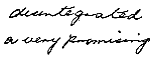
ARTFUL SIMPLIFICATIONS
These
are departures from the writing style taught in school whereby
the writer adopts a more economical style of writing by eliminating
unnecessary strokes, but still maintaining legibility.
This
produces an overall faster writing speed. This should not be
confused with poorly coordinated writing, which is generally
illegible. |

|
 Examples
are: the removal of upper and lower loops, combining two letters
to form one (but still distinguishable within the context of
the word), counter-clockwise looping in the letter 'g', and elevated
joining loops to following letters. Look for a generally simplified
script, where the writer has obviously produced a more economical
way to write, without compromising legibility. Examples
are: the removal of upper and lower loops, combining two letters
to form one (but still distinguishable within the context of
the word), counter-clockwise looping in the letter 'g', and elevated
joining loops to following letters. Look for a generally simplified
script, where the writer has obviously produced a more economical
way to write, without compromising legibility. |
|
Artful Simplifications? |
|

|
No departure from school-taught
style of writing (as above). |
|
Some simplifications apparent, but generally
as above. |

|
Moderately simplified writing (as above). |
|
Many simplifications present (as above). |

|
Writing highly simplified (as above). |
|
SIGNATURE SIZE
To
measure the signature size, you can either construct a signature
grid (as per the diagram), print the image using this link,
or measure the signature as described below and calculate the
size rating in that manner.

|
|
The
signature grid consists of a vertical Edge line and a horizontal
base line. The length measuring lines (numbered 1 - 7) are the
following distances from the edge line:- |
1
= 25 mm (1 inch)
2 = 38 mm (1 and 1/2 inches)
3 = 51 mm (2 inches)
4 = 64 mm (2 and 1/2 inches)
5 = 76 mm (3 inches)
6 = 89 mm (3 and 1/2 inches)
7 = 102 mm (4 inches) |
|
The
height measuring lines (lettered A - E) are the following distances
from the base line:- |
A
= 8 mm (5/16's inch)
B = 14 mm (9/16's inch)
C = 21 mm (13/16's inch)
D = 27 mm (1 and 1/16's inch)
E = 33 mm (1 and 5/16's inch) |
|
If
you can, construct the grid on tracing paper. It is then easy
to lay the grid over the signature to grade its size. Alternatively,
by printing the image using this link onto thin paper or an overhead transparency,
you should be able to produce a signature grid with the correct
measurements. Please check that the dimensions
of your signature grid are correct when you have printed it out.
To
measure the length of the signature, lay the grid (or begin your
measurement) from the very first left-hand stroke of the signature.
The base of the grid should be angled so that it runs parallel
with the base of the signature, as in the example. Look at the
position of the last stroke of the signature in relation to the
numbered lines. In the illustration, the 'y' extends further
than line '4'. The length for this signature would be recorded
as '5'. When the last letter falls between two length lines,
always use the higher of the two numbers. If you are just using
a ruler to measure the signature, compare the length with the
reference lengths above, and grade the line in a similar way.
(e.g. if the length of the signature is 18 mm, then the length
would be grade '1').

|
|
Signature
Length? |
Grade 1 (up to 25 mm long)
Grade 2 (26 -
38 mm long)
Grade 3 (39 -
51 mm long)
Grade 4 (52 -
64 mm long) (Select if no signature available)
Grade 5 (65 -
76 mm long)
Grade 6 (77 -
89 mm long)
Grade 7 (90 -102
mm long)
Grade 8 (103 mm
long and greater) |
|
To
measure the signature height, place the line marked BASE
on the grid under the signature, as shown on the illustration.
If the signature slants up or down, angle to the grid accordingly.
The base line must follow the small letters of the signature.
Ignore letters with lower loops, such as 'g', 'j' or 'q'. Now
observe at what level the highest part of the signature reaches
with regard to the horizontal lines. If the highest point of
the signature falls between two lines, always use the upper line
to grade the height. In the illustration, the 'l' of the signature
falls between lines 'B' and 'C', so the height would be graded
as 'C'. If you are just using a ruler to measure the height of
the signature, as with the length, compare the result with the
reference heights above, and grade the height of the signature
using that table.
|
|
Signature
Height? |
Grade A (up to 8 mm high)
Grade B (9 - 14
mm high) (Select if no signature available)
Grade C (15 -
21 mm high)
Grade D (22 -
27 mm high)
Grade E (28 -
33 mm high)
Grade F (34 mm
high or greater) |
Is the signature
scrawled?
(i.e.
is it unreadable?) |
No
Yes
|
|
Is the signature
underlined? |
No
Yes
|
|
If the signature
is underlined, is it bizarrely underlined (many strokes, loops,
curls etc.)? |
No
Yes
Not applicable |
ANCHOR STROKES
 Anchor
strokes are strokes which start at the beginning of words. They
are small hooks, which 'anchor' the first letter of the word
to the (imaginary) baseline. Do not confuse these with 'long
straight upstrokes' which are not hooked and will be discussed
later in the analysis. Anchor strokes are always curved. Anchor
strokes are strokes which start at the beginning of words. They
are small hooks, which 'anchor' the first letter of the word
to the (imaginary) baseline. Do not confuse these with 'long
straight upstrokes' which are not hooked and will be discussed
later in the analysis. Anchor strokes are always curved. |
|
Anchor Strokes? |
No anchor strokes found
One or two examples
found
Anchor strokes very
common |
MISSING 'i' DOTS
An
easy one! Count (roughly) the proportion of small 'i's which
are NOT dotted. |
|
Missing 'i'
Dots? |
None, or only one or two 'i'
dots missing
A quarter of the 'i'
dots are missing
Half of the 'i' dots
are missing
Three-quarters of the
'i' dots are missing
All of the 'i' dots
are missing |
|
SIZE OF CAPITAL LETTERS COMPARED TO ASCENDING LETTERS |
|
First
- to clarify what the ascending letters are. These are the 'b's,
'd's, 'f's, 'h's etc. Compare these 'ascenders' with the size
of any capital letters used in the writing, particularly at the
beginning of sentences.
Look
at the table opposite, and use the examples to score the average
size of the capital letters in relation to the 'ascenders'. The
options will allow you to use intermediate scores as well. |
|
Example |
Description |

|
Extremely
High (Score=10) |

|
High (Score=5) |

|
Ascenders
and capital equal (Score = 0) |

|
Low (Score
= -5) |

|
Extremely
Low (Score = -10) |
|
|
Scoring capital
letters compared to ascending letters:- |
10 EXTREMELY HIGH
- Capital letters about twice as tall as the ascending letters
9
8
7
6
5 HIGH - Capital
letters about half as tall again as the ascending letters
4
3
2
1
0 EQUAL -
Capitals and ascenders the same height in general
-1
-2
-3
-4
-5 LOW -
Capital letters about three-quarters the height of the ascenders
-6
-7
-8
-9
-10 EXTREMELY
LOW - Capital letters only half the size of the ascending
letters |
|
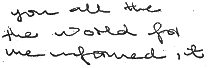
SMALL HANDWRITING |
Is the writing
as small or smaller than this example ?

Note:
The actual size of the word 'Today' in the example is 10mm (0.4
inches). |
No
Yes
|
Is the handwriting
larger than the first example above, but no larger than this
example?

Note:
The actual size of the word 'possible' in the example is 14.5mm
(0.57 inches). |
No
Yes
|
FALLING LINES
Some
writing tends to fall downwards as it goes across the page. |
Do the lines
fall as much, or more than this example?
 |
No
Yes
|
Does the
writing fall less than the first example above, but as much,
or more than this example?
 |
No
Yes
|
CROWDING
OF WORDS |
Are the words
as crowded, or more crowded, than this example?
 |
No
Yes
|
Are the words
less crowded than in the first example above, but as crowded,
or more crowded than this example?
 |
No
Yes
|
RIGID SCRIPT |
|
Is the script
clearly 'rigid' (restrained) as in this example?
 |
No
Yes
|
DOWNWARD
POINTING 't' BARS
 The
school taught small 't' has a level cross bar. However, some
writers produce 't' bars which point, slope or droop downwards
(See example). Count the 't' bars, and give a reasonable estimate
of the proportion of 't' bars that point or droop downwards. The
school taught small 't' has a level cross bar. However, some
writers produce 't' bars which point, slope or droop downwards
(See example). Count the 't' bars, and give a reasonable estimate
of the proportion of 't' bars that point or droop downwards. |
|
Proportion
of Downward Pointing 't' Bars? |
None, or only one 't' bar points
down.
A quarter of the 't'
bars point down.
Half of the 't' bars
point down.
Three quarters of the
't' bars point down
All the 't' bars point
down. |
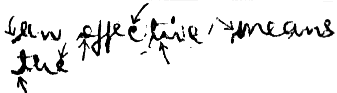
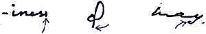
POINTED DASHES
 Pointed
dashes are the result of impulsive stabbing movements as the
writer finishes on a stroke that doesn't connect one letter to
another, e.g. the bars on the letters 'f' and 't'. The dashes
tend to be thick at one end and trail off to a very thin line
at the other. Pointed
dashes are the result of impulsive stabbing movements as the
writer finishes on a stroke that doesn't connect one letter to
another, e.g. the bars on the letters 'f' and 't'. The dashes
tend to be thick at one end and trail off to a very thin line
at the other. |
|
Frequency
of Pointed Dashes? |
There are no
pointed dashes
They only
occur now and then
Pointed dashes
are a consistent feature
|
LONG STRAIGHT
UPSTROKES
 These
should not be confused with anchor strokes, which were described
earlier in the questions. Whereas anchor strokes curve down to
meet the baseline, long straight upstrokes begin from below the
baseline. The strokes are found at the beginning of words, starting
below the writing line and coming up to start the letter. These
should not be confused with anchor strokes, which were described
earlier in the questions. Whereas anchor strokes curve down to
meet the baseline, long straight upstrokes begin from below the
baseline. The strokes are found at the beginning of words, starting
below the writing line and coming up to start the letter. |
|
Frequency
of Long Straight Upstrokes? |
No long straight upstrokes.
Found only once or
twice in the sample.
Used on less than
three-quarters of the words, but still a consistent feature of
the writing.
Found at the start
of three-quarters of all words, or more. |
|
If Long Straight
Upstrokes are present, is the pressure used for them greater
than in the rest of the writing? |
No
Yes
Not applicable |
END OF WORD
PRESSURE
 Closely
examine the final stroke of the words, to see if there is any
increased pressure in the final movement of the pen. This will
be shown by a darkening of the ink and/or a thickening of the
line. Closely
examine the final stroke of the words, to see if there is any
increased pressure in the final movement of the pen. This will
be shown by a darkening of the ink and/or a thickening of the
line. |
|
Frequency
of End Of Word Pressure? |
There is
no apparent end of word pressure
End of
word pressure is found only once or twice
End of word
pressure appears consistently
|
LETTER SLANT |
Does the
writing slant to the right as much or more than this example?
 |
No
Yes
|
Does the
writing slant to the right less than the first example, but as
much or more than this example?
 |
No
Yes
|
Does the
writing slant to the right less than the second example, but
as much or more than this example?
 |
No
Yes
|
WIDTH OF
SMALL LETTERS
Look
at the width of the small letters, particularly the 'round' letters
such as 'a', 'o' and 'e'. It is not the actual size of
the letter that is important - more the width compared to the
height. |
Are the small
letters as wide as, or wider than this example?
 |
No
Yes
|
Are the small
letters narrower than the first example, but as wide, or wider
than this example?
 |
No
Yes
|
LENGTH OF
DESCENDING STROKES
Descending
strokes are the parts or loops of the letters 'y' and 'g' below
the writing line. As with letter width, it's not the actual size
of the descending strokes that is important. It is the length
of the strokes in comparison with the other letters. |
Are the descending
strokes as long, or longer than this example?
 |
No
Yes
|
Are the descending
strokes shorter than the first example, but as long or longer
than this example?
 |
No
Yes
|
CIRCULAR
'i' DOTS
Rather
than use a simple dot for their small 'i's, some writers actually
use a circle. |
|
Are circular
'i' dots present in the handwriting? |
No
Yes
|
LOWER LOOP
EMBELLISHMENTS
 Some
writers use embellishments on lower loops of letters such as
'y', 'g' etc. Rather than doing a simple loop, the stroke includes
additional loops or whorls which make the lower loop look quite
complex or fancy. Some
writers use embellishments on lower loops of letters such as
'y', 'g' etc. Rather than doing a simple loop, the stroke includes
additional loops or whorls which make the lower loop look quite
complex or fancy. |
Do half,
or LESS than half of the lower loops have embellishments?
(Answer
'No' if no lower loop embellishments are present) |
No
Yes
|
Are lower
loop embellishments present in MORE than half of the lower loops?
(Answer
'No' if no lower loop embellishments are present) |
No
Yes
|
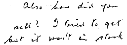
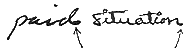
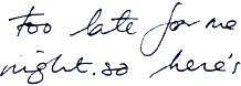
ISOLATED
AMBIGUITY
Isolated
ambiguity can best be described as writing that is difficult
to read - but (and this is very important) not through general
poorly coordinated writing. |
|
In
poorly coordinated writing (first example), none of the words
can be easily read. However, with isolated ambiguity (second
example) only some of the words are difficult to read, and these
can usually be understood from the context of the sentence. They
are not so much indecipherable, as confusing. |
|
Take
a look at the writing. If you see any words which are readable,
but confusing, try covering the surrounding words and see how
the word looks on its own. Look to see if it is legible as a
single word, or perhaps could be misread as several words. Now
look at it again within the context of the words surrounding
it. If it is then readable you have found isolated ambiguity. |
Poorly Coordinated Writing
|
|
 Isolated
ambiguity Isolated
ambiguity
|
|
Is isolated
ambiguity a dominant feature of the handwriting? |
No
Yes
|
BACK SLANT
Back
slant is a leftward slant of the handwriting. Handwriting normally
slants to the right, but some slants in the other direction.
This is not only caused by left-handedness. |
|
Does the
writing exhibit back slant? |
No
Yes
|
SLANT VARIABILITY
Most
writers manage to maintain an even slant, with all the letters
tilted in more or less the same direction. Other writers seem
unable to achieve this consistency, and the slant of their writing
swings one way then the other. If there is a definite leftward
and rightward slant in the writing, then the writing is said
to show slant variability. |
Does the
writing exhibit slant variability as much, or more than this
example?
 |
No
Yes
|
SMALL LETTER
VARIABILITY
Most
writing normally has small letters of approximately equal size
(that is letters such as 'a', 'o', 'u' etc). However, some individuals
seem unable to control the size of such letters and they can
appear to vary greatly in comparative size. Look for small letters
being twice or half the size of similar ones within the handwriting. |
Does the
writing exhibit small letter variability as much, or more than
this
example?
 |
No
Yes
|
NARROW UPPER
LOOPS
Most
upper loops ('l', 'd', 'h' etc) are either clear loops, or are
perhaps not looped at all. However, some writers loop, but the
loops are very narrow with the lines overlapping each other.
These are termed 'narrow upper loops'. |
Does the
writing have narrow upper loops?
 |
No
Yes
|
LINE OVERLAP
Do
the strokes from one line impinge on the strokes from the line
below? Some writers create writing which seems very cramped,
where the loops from letters such as 'y' and 'g' touch the letters
beneath them. The occasional occurrence of this is not important,
but a consistent overlap of loops and overlap of lines is significant. |
Does the
writing exhibit line overlap?
 |
No
Yes
|
WAVINESS OF THE WRITING LINE
When
writing on plain, un-lined paper, the normal writer can produce
straight writing lines without the use of a ruler for guidance.
Some writers, however, cannot produce straight writing lines.
If the lines on the page seem to snake their way up and down,
as if the writer seemed to have poor co-ordination, then the
handwriting is said to exhibit waviness of the writing line. |
Does the
writing exhibit waviness of the writing line?
 |
No
Yes
|
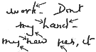
POORLY CO-ORDINATED WRITING
This
is general sloppy letter formation (varying sizes), poorly spaced
writing, wavy writing lines, missing letters, unintentional strokes,
and general sloppiness. Do not mix this up with the artful simplifications
specified in earlier questions, where letters have been formed
economically but the writing is still legible. Also, isolated
ambiguity, because it is only is occasional words, should not
be confused with general poorly co-ordinated handwriting. |
Is the writing
poorly co-ordinated?
|
No
Yes
|
STROKE JERKS (Magnifying glass
useful)
Stroke
jerks are found within the individual strokes in letters, where
there has been a small but sudden departure of the pen from its
intended direction. Instead of the smooth stroke the writer intended,
there are slight bends in the line. This often gives the letters
more of an angular look. |
Does the
writing contain stroke jerks?
 |
No
Yes
|
BROKEN UPPER
LOOPS
Upper
loops, when written in letters such as 'h' or 'l' or 'k', are
normally full loops if that is the style the writer uses. However,
some writers, although they use loops, do not produce loops which
are full. Instead, the loops are broken or incomplete. The loops
finish early, or have definite gaps in them. |
Does the
writing contain broken upper loops?
 |
No
Yes
|
|
CURTAILMENT
Curtailment
is handwriting restraint, where the writer has restrained the
writing impulse when the forward momentum threatened to escape
from their control. The effect is to produce a series of clipped
movements or 'chopping off' of letter strokes.
 
|
|
The
evidence of curtailment is the premature ending of letter strokes.
An example would be on downward loops of 'y's and 'g' where the
stem ends shortly and abruptly. This shouldn't be confused with
the missing loop created by artfully simplified writing. With
curtailment, the abrupt ending of letter strokes is always associated
with an increased pressure, a fact which emphasises that the
writer has applied strong measures to maintain control.
There
are many different forms of curtailment, but the underlying feature
is the abrupt end to letter strokes, with increased pressure,
which indicate that the writer was exhibiting an excessive need
for control of the writing. |
|
Frequency
of curtailment? |
No curtailment
One or two examples
found
Curtailment very common |
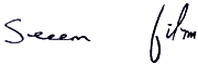
LETTER STUTTER
Letter
stutter is the accidental repetition of letters in a word, or
of strokes when forming a letter. Examples would be perhaps words
with a double letter (such as 'e' in the word seem) where the
'e' would be written three times, or an extra 'hump' on the letter
'm'. Anywhere where an extra stroke or letter has been used unnecessarily
is letter stutter. Stutters which occur twice or more within
a piece of handwriting are significant. See also repeated 'i'
dots and 't' crosses below. |
Frequency
of letter stutter in the handwriting?
 |
No letter stutter
Letter stutter
present, but not common
Letter stutter
very common |
REPEATED 'i' DOTS AND 't' CROSSES
Examine
the handwriting to see if there are any occurrences when 'i's
have more than one dot, or 't's have more than one cross bar. |
Frequency
of repeated 'i' dots and/or 't' crosses in the handwriting?
  |
No repeated 'i' dots
and 't' crosses.
Repeated
'i' dots and 't' crosses present, but not common
Repeated
'i' dots and 't' crosses very common |
OVERWRITING
This
is where letters have been traced over again and again, as if
the writer is anxious about making the letters clearer, and strives,
counter- productively, for greater clarity. |
Frequency
of overwriting in the handwriting?
  |
No overwriting.
Overwriting
present, but not common
Overwriting
very common |
COMPULSIVE
ADDITIONS
 |
|
These
are additional strokes which improve neither the legibility nor
the aesthetic look of the letters. They usually occur in the
upper or lower loops as an added extension. It seems that the
writer has been unable to resist adding something to the letter,
even though it was perfectly legible in the first place. |
|
|
Frequency
of compulsive additions in the handwriting? |
No compulsive additions.
Compulsive
additions present, but not common
Compulsive
additions very common |
FADING
 Fading
is where the starting or end strokes of words show a loss of
pressure. Fading at the start of a letter is due to the writer
applying insufficient force until the stroke of the pen was well
into the formation of the stroke. Fading at the end of the letter
is due to the pressure being released too soon. They both reflect
an inability of the writer to maintain writing pressure. Fading
is where the starting or end strokes of words show a loss of
pressure. Fading at the start of a letter is due to the writer
applying insufficient force until the stroke of the pen was well
into the formation of the stroke. Fading at the end of the letter
is due to the pressure being released too soon. They both reflect
an inability of the writer to maintain writing pressure. |
|
Frequency
of fading? |
No fading.
Fading present,
but not common
Fading very
common |
RESTING DOTS
A
thickening of the strokes at the very beginning or end of letters
(do not confuse with end of word pressure) is sometimes caused
by the writer hesitating momentarily before moving the pen onwards.
As the title suggests, these dots are caused by the pen coming
to rest for a fraction of a second as if the writer is resting. |
Frequency
of Resting Dots?
  |
No resting dots
Resting dots
found occasionally
Resting
dots common |
WAVY WORDS
Wavy
words are where the normally-formed handwriting has suddenly
degenerated into a formless line. Normally, less pressure is
used in conjunction with this type of stroke. As a result of
the waviness, the letter size is reduced. You must be careful
to ensure that this is not just the style of writing. Wavy words
have letters which stand out as being reduced in size and pressure,
almost is if the writer was too tired to write the letter at
it's normal size. |
Frequency
of Wavy Words?
 |
No wavy words
Wavy words found
occasionally
Wavy words common |
LETTER
LURCHES
(Magnifying glass useful)

Letter
lurches are sudden movements of the pen in the upward and downward
strokes of letter formation. The pen has moved sideways slightly
as the upward or downward stroke was completed. The movements
are small, and should be examined with a magnifying glass. |
|
Frequency
of Letter Lurches? |
No letter lurches
Letter lurches
found occasionally
Letter lurches
common |
BROKEN STROKES
(Magnifying glass useful)
Complete
loss of pressure (perhaps for only 1/100th of a second) can cause
Broken Strokes. Here, the line of the letter is completely broken
by a small gap in the stroke, where the writing pressure has
completely failed for a brief moment. These breaks may be very
small, so examine the writing carefully, as they are an important
characteristic. |
 Frequency of Broken
Strokes? Frequency of Broken
Strokes?
 |
No broken strokes
Broken strokes
found occasionally
Broken strokes
common |